Viewership Dynamics Model
A network model that finds a channel's real competitive set, and a retention model that breaks down where and why viewers leave.
I spent five years on content strategy for SocksIRL, which mostly meant staring at retention graphs trying to figure out why one video worked and a nearly identical one didn't. YouTube Studio is good at telling you what happened. It's much worse at telling you why, and it has no opinion at all about who you should be measuring yourself against.
So I built the Viewership Dynamics Model. There are two parts: a network model that finds a channel's real competitive set, and a retention model that breaks down where and why viewers leave.
1. Modeling a channel's competitive network
Ranking channels by subscriber count is close to useless here. The 10-million-sub channel in your category might share almost nothing with your audience.
Instead I pulled recent video titles from public feeds for about 100 channels, turned each channel into a TF-IDF vector built from its name and upload titles, and compared them with cosine similarity. Any given channel only touches a small slice of the total vocabulary, so I stored the vectors as sparse hash maps.
With 97 channels that's 4,656 pairwise comparisons. The pass is O(n²), which would matter at real scale and doesn't matter at this one.
The similarity scores became a weighted graph. My first version drew every edge and produced a mess basically, so I moved to an adjacency list and kept only the four strongest edges per node. Rather than hardcode a cutoff, I set the threshold at the 75th percentile of the actual similarity distribution, which lets the graph adapt to whatever dataset it's handed instead of assuming one number works everywhere.
Communities come from label propagation: every node starts with its own label and repeatedly adopts the strongest weighted label among its neighbors. The algorithm can land on different valid answers, so I capped iterations and broke ties deterministically.
The result is what I was actually after. The biggest creator in a category is almost never your most useful comparison. The useful one is whoever is already making content for the same audience.
2. Reading retention curves as sequences
The retention side ingests 46 real YouTube Studio exports covering roughly 445 million views and 36,800 individual curve points, including overall retention, subscribers vs. non-subscribers, new vs. returning, and loyalty tiers.
I treat each curve as an ordered sequence and derive hook strength, steepest drop, rewatch spikes, loop behavior, and gaps between audience segments. Finding the worst stretch of a video turns out to be a maximum-subarray problem.
I also compute a position-wise median curve across the whole catalog. Median rather than mean, because Shorts routinely break 100% retention through looping (sometimes, like 300%).
The clearest example it surfaced was a 21-million-view short that held about 75% of viewers through the video, then dropped 29 percentage points around the 94% mark. By every dashboard metric, that video is a win. The curve says viewers were leaving at the final transition instead of looping back into the opening, which is a fixable ending on a video that already worked.
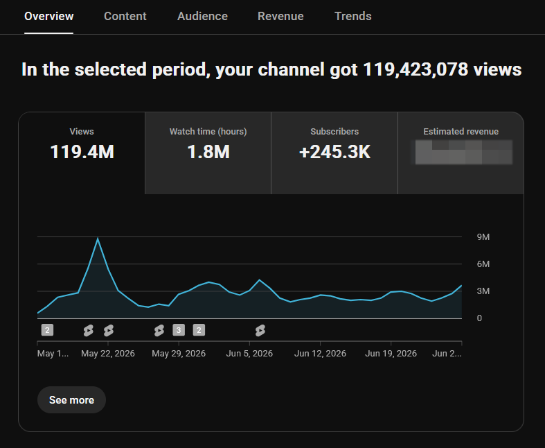
The network model tells you who to compare against. The retention model tells you whether your problem is the hook, the pacing, the sponsor read, or the last two seconds. I was running this while the network was doing over 100 million views a month. Every conclusion traces back to a specific channel, video, or segment. Everything is a calculated decision.